
5 Examples of the Best Bank Websites. What Makes Them Stand Out?
To gain an advantage over the competition, it's necessary to provide the users of a banking website or application with convenient solutions and an offer tailored to their expectations. The first contact of a bank with its client often takes place on the web. Take a look at this compilation of the best bank websites before you start building your web page.
What features make a bank website more effective?
Banking is increasingly going online. These days, in order to take advantage of new banking products, you often don't need to visit a branch at all. A few clicks in a mobile application or on a web page is enough. Clients want security and efficient service. Therefore, banks not only have to be trustworthy but also guarantee convenient solutions that'll provide their users with a positive experience when using the web page. In addition to the key elements of websites, there are also solutions very typical of the financial industry, used to guarantee the best bank web pages such features as:
- Efficiency and functionality. First and foremost, you need to consider what activities your banking website should allow the users to perform. The stage of planning a company web page for a bank is very important – it consists of defining the functionalities of the website and creating a strategy for solving your clients' problems. Don't forget to design a support process for your end users. It's worth considering using a chatbot that'll automate some of the processes and facilitate customer service.
- Responsiveness and intuitiveness. Users want to have access to their banking services and products anywhere, anytime. Adapting the banking website to the displays of various devices is therefore essential. Whether on a computer, tablet, or phone, using it should be easy and convenient. To ensure the web page's ease of use, you need good navigation with, for example, CTA buttons. Well-placed, visible buttons allow you to easily navigate the pages, but also "lure" the user onto the route planned by the website creators.
- Content and offer personalization. We all have different preferences, needs, and expectations. Recommendation engines will ensure that specific user groups are presented with appropriate offers. Those who are planning to buy an apartment will see a subpage advertising a mortgage loan, while those reading about running their own business on the web – a subpage with an offer for companies. Personalization allows you to automatically offer the clients what they need the most.
- Security. Modern systems allow good protection of the website against cyber-attacks and fraud. Don't forget about an effective user verification process when logging in, making transactions, or ordering new services.
The best bank websites – examples
It isn’t hard to see that many bank websites look outdated. One of the reasons is probably the fact that banking systems are very complex and expensive, and the IT projects conducted in this industry are usually complicated, costly, and time-consuming. You should keep in mind, however, that the market is constantly changing. New solutions are created and new trends are formed. It's therefore imperative to simplify processes and modernize bank platforms.
It's worth investing more in a flexible solution that'll allow you to easily adapt to the expectations of your clients and new trends on the market. This may be a significant expense, but you'll ultimately save on costly website rebuilds in the future and gain a competitive advantage.
In one of our articles, we draw attention to the most interesting technological solutions on the banking market. Find out which of them were used on the best bank websites.
1. NBKC Bank
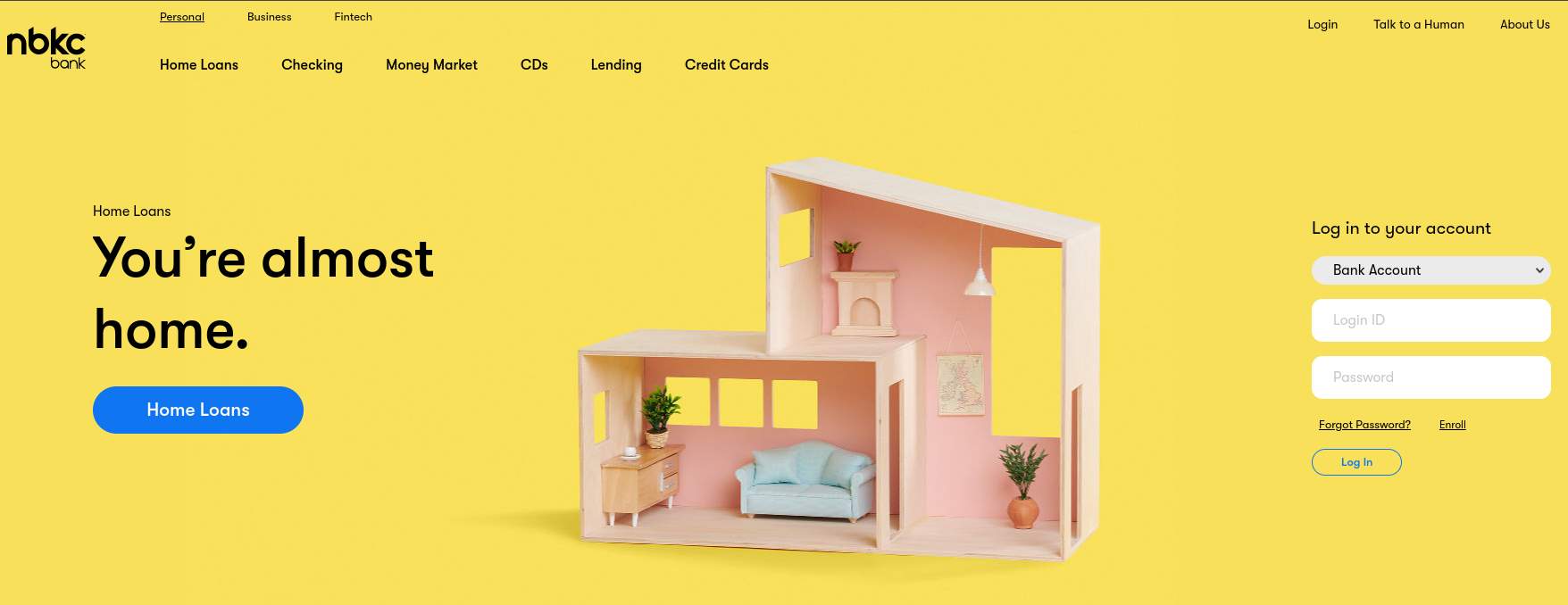
The interesting login solution on the NBKC bank web page deserves attention. At first glance, the login form with a button and fields to enter the login and password looks typical. However, if you look closely, you'll see an additional drop-down list above these elements, from which you can choose what part of the system you want to log in to – bank account, loan services, or credit card services.
Source: NBKC Bank
We also appreciate the clear and comfortable navigation. At the very top, above the main menu, there are buttons that allow you to change the view depending on what services you are interested in – for business, for an individual client, or for a company from the fintech industry. This allows for better adaptation of the content and offer to a specific target group.
Testimonials from satisfied clients are appropriately distinguished from other elements of the bank website and meet the good practices in the field of publishing opinions. The user sees the testimonial author's photo, their name, and a brief statement.
The bank enables efficient communication with the client, offering them the use of live chat at specified hours. If the user tries to connect with a consultant outside of working hours, in the same window they can send a message which the employee will reply to later, or select one of the recommended articles with additional information.
2. Chase
As in the previous example, on the Chase bank website, above the main menu, there are buttons that allow you to switch between different versions of the page – those addressed to individual clients, small businesses, and medium-sized companies and corporations.
This banking site stands out from others due to its expanded navigation. There's a section on products and services on the home page. There are buttons in it, thanks to which the user can go to the services that interest them with just one click, without further browsing the home page. The process of selecting a service is simplified and reduced to a minimum. In some cases, it only takes a potential client just two clicks to be transferred to the form for opening an account.
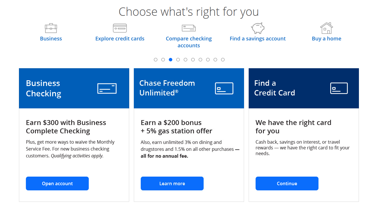
Chase uses its landing pages and articles to increase trust and reduce the distance between the bank and the client. Selected subpages are promoted on the home page below the product section. You can find tips there, but also information on the social initiatives in which the bank is involved.
Chase also ensures the security of user accounts by allowing business clients to log in using tokens. Such logging requires the use of a special device that generates a new code every 60 seconds.
3. Umpqua Bank
On its web page, Umpqua Bank focuses on creating the image of a community-building institution, supporting and enabling development for individual persons and businesses. The hero section contains a CTA that redirects the user to a subpage presenting a kind of portfolio of the institution – descriptions of the projects financed by Umpqua Bank and testimonials of representatives of individual companies.
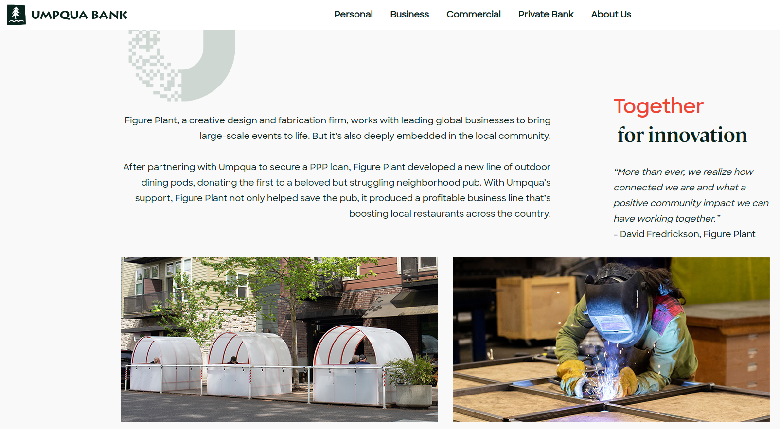
This banking website uses a pull-down menu to make the page clearer. This solution is often used on web pages containing many subpages (bank websites are usually quite complex). The main menu divides the subpages according to the type of user (individual client, company, corporation, personalized financial services), and the drop-down lists show important and most frequently visited subpages.
Putting a search engine on the home page, in the upper right corner, makes it much easier for the user to navigate the content, which there's usually quite a lot of on bank websites. On the Umpqua site, this solution allows you to quickly find regulations, articles, and details of the offered products and services, which is very helpful. A manual search on such a complex website could be time-consuming.
4. ICICI Bank Limited
The ICICI Bank Limited web page definitely stands out from other popular banking websites with its design. Vivid colors and dynamic elements catch the eye of any potential client. At the top of the website, advertisements for various offers for the individual client are displayed in the form of a carousel. You can swipe them manually or simply wait for the next message to appear. In the same area, there are static elements – shortcuts to the most important parts of the web page and various forms of contact (e.g. Whatsapp).
The bank provides its users with a search engine located at the top of the page. This element is clearly visible and animated, making it quickly noticeable. You can use it to search for specific products and services. What's more, when you hover the cursor over the search field, the window below displays hints, suggestions, and buttons that allow you to perform specific actions, as well as a simple chatbot. The user selects one of the suggested questions and the bot sends back an answer or another question.
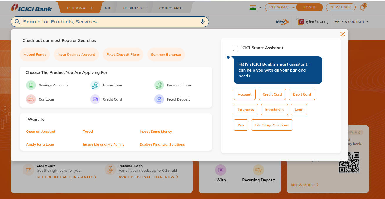
Further down this bank website, you'll find an offer filtering tool. You can select the type of product or service from the list (e.g. account, card, loan, investments, etc.) and select the end recipient (individual client, business client, etc.). The offers best suited to your needs will appear below.
5. HSBC UK
The HSBC UK bank website uses a chatbot to quickly establish contact with the client. This bot, however, is quite simple. Although it uses NLP (natural language processing – a technology that allows analyzing human language) to interpret manually entered questions of clients, it can't answer in any other way than by displaying a list of topics which the client can choose from. The chatbot also informs about the possibility of contacting support in other ways if the problem isn't solved. This bot is mainly informative.
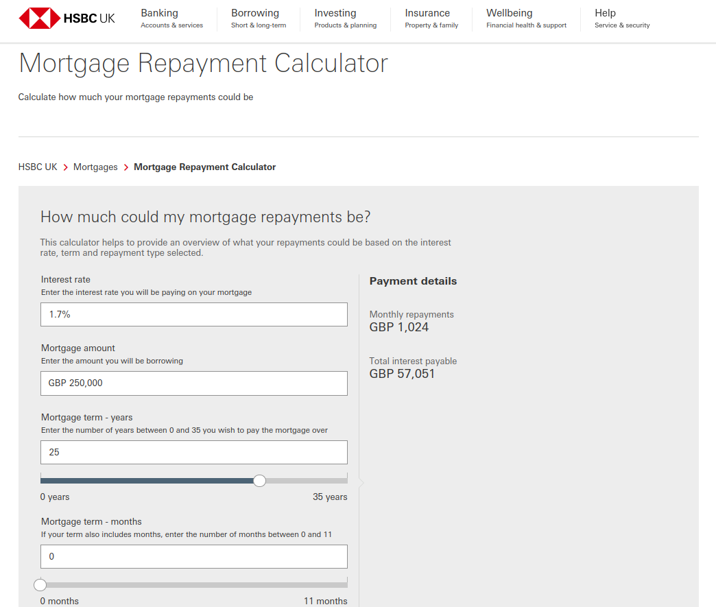
The bank also offers its potential clients useful financial calculators that help to calculate the cost of a possible loan and the amounts of its installments, for example. You can find them in various sections on the home page. This makes it much easier for the client to make a decision about applying for a loan.
The mid-page sections: Support and security, Tools and guides, and More products, collect in one place useful links to interesting areas within the bank website and make it easier for potential clients to navigate the web page. There are links to tips, calculators, and articles.
Creating a bank website in Drupal
Among the technologies that can be used to build a bank website, Drupal stands out for its high security. An experienced and attentive Drupal Security Team regularly analyzes this CMS in terms of security. Drupal's solutions for data security include:
- Data encryption. Thanks to this mechanism, the third parties who don't have the appropriate "key" (e.g. the parties stealing data) aren't able to read information about your company, clients, or systems.
- Advanced permission management. You can define roles for the people using the CMS and assign each type of user access to different functionalities and data.
- Modern error reporting system. The appropriate tools record every security breach. This allows identifying elements vulnerable to attack by cyber-criminals and strengthening security where necessary.
- Extensive cache. Enables effective defense against DoS (Denial of Service) attacks. The purpose of such a cyber attack is to make it impossible to use a computer system or network service. There are many types of DoS attacks that differ in terms of the technique used.
Security isn’t the only strong point of Drupal. Developers value this system primarily for its flexibility, thanks to which they can add many interesting functionalities to a banking website, such as financial calculators (to calculate the amounts of installments), advanced content filtering, search engines, or the possibility of using segmentation and personalization.
The flexibility of this CMS also guarantees the possibility of integrating it with numerous applications and services. Drupal-supported integrations include:
- marketing automation solutions (Mautic),
- mailing systems (e.g. Freshmail, Mailchimp),
- advanced reporting tools (Google Analytics),
- social media.
The latest version of Drupal (10) is expected to appear on the market on 14 December 2022. The community gathered around this CMS regularly works on improving the code, preparing modules, and implementing new solutions. In the case of Drupal 10, this will be integration with CKEditor 5, as version 4 will no longer be supported after 2023. You can read more about the new version of this CMS in the linked article. The most important thing is that Drupal is being regularly improved, so you can be sure that your bank website built using this CMS will be efficient, secure, and modern.
It's worth knowing that Drupal is already used on bank web pages. The Bossa portal was built using Drupal. Our specialists worked with the Bossa team practically from the very beginning of the project and advised on the architecture appropriate for their finance website. Together, we've created a convenient environment for project development, which not only accelerated the work at that time but also allowed for quick implementation of changes and new functionalities in the future. Using the solutions such as Layout Builder significantly helped in the creation of views and the arrangement of content on individual pages. The new Bossa website has been built using modern technologies, thanks to which the costs of creating, maintaining, and managing the web page have been reduced.
Best bank websites - summary
The best bank websites are efficient, fast, responsive, and secure. Intuitiveness and functionality are also important. These can be ensured by using the proper elements – there are many functionalities that can increase the effectiveness of a banking web page, such as chatbots, search engines, financial calculators, etc. Drupal is one of the technologies worth considering when building a bank website. It's a flexible and secure CMS with many interesting modules that expand it with new possibilities. Find out more about web development for the financial services industry companies.


