The Best Newsletter Designs and Elements that Make Them Stand Out
The job of an email marketer is to constantly chase ideas and stay on top of the latest trends. In this article, we’ll focus on the best newsletters created by brands in recent years and explain what makes them effective tools for promoting a company and its offerings. See our examples and get inspired.
What can a newsletter be about?
A newsletter, unlike other email marketing campaigns, is issued on a regular basis, and its purpose is to provide interested recipients with up-to-date information about a particular company. Examples of topics you can cover in it include:
- Events in which your company has participated or will participate. Tell your readers about a successful presentation at a recent industry conference, or invite them to your booth at a trade show coming up soon.
- Publications on blogs and external websites. You can also encourage recipients to read articles recently published on a blog or external website to help them better understand the company, its important values, and its offerings.
- Changes in the company. It's also a good idea to mention a reorganization at your company in your email newsletter, especially if any improvements could affect the way it operates and serves customers.
- Current offerings and new products. The newsletter can include information about new products and services. To this end, devote at least a small section of this email to introducing potential customers to the advantages and functionalities of your flagship product or announcing the release of a brand-new product.
As you can see, a newsletter is a message that fulfills different purposes at the same time, composed of a variety of elements and data, so creating an effective and consistent newsletter isn’t easy. What are other brands doing to design the best email newsletters?
Key template elements and best practices for newsletters design
You don't have to create a design from scratch. Even the most recognizable brands make it easy for themselves by customizing the best newsletter templates to their individual needs. The most important thing is to choose a design that will allow you to achieve your business goals. Then you need to find a newsletter example that includes the necessary elements, such as eye-catching headlines. They should be distinguished by their style, size, and position relative to other elements (text boxes, images, etc.).
It’s advisable to use a template that has an opening graphic - a larger image that relates to the content of the message, is consistent with the company branding, and is placed at the top of the newsletter.
Below the highlighted graphic, it’s worth placing an introductory text - a paragraph that announces the most important information contained in the email newsletter and encourages further reading. Since digital newsletters generally contain a lot of content, it’s worth betting on the brevity and simplicity of the message.
Modifying the template shouldn’t just replace the sample data with your company's data. From the very first section, the newsletter should evoke an association with a specific brand. This means choosing the right colors, graphics, and text styles. The best fonts for newsletters should be sans-serif - simple. Ornate writing tires the eye and can discourage the recipient from continuing to read. Also, keep in mind that not all more sophisticated fonts are supported by email programs, so they may not display properly or even disrupt the look of the template.
When creating a newsletter, you shouldn’t also forget about call-to-action buttons and links placed in strategic places. These will allow the reader to jump to more comprehensive information posted on your website.
Best financial newsletters designs
Newsletters of this type usually contain information about changes in the stock market or events that may affect the value of shares. Their function is primarily informational, but you can also find advertisements in them (premium versions of the portal, mobile applications useful to investors, and more) or invitations to conferences.
1. The Daily Upside
The Daily Upside is a financial website with news from the industry and the business world. You can sign up for daily newsletters on it. Through such regular mailings, the brand increases its online presence.
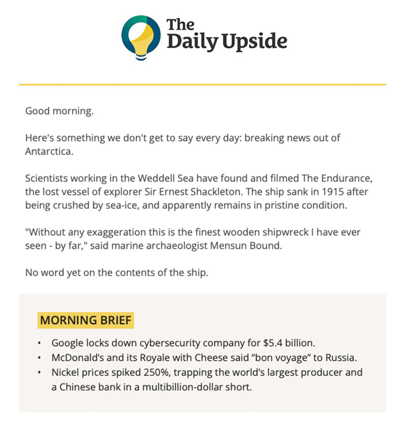
The creators of these emails use good practices in newsletter design, keeping content to a minimum and prioritizing information. In this way, they meet the expectations of the user, who wants to receive a summary of the most important news and achieve their business goal by encouraging the user to go to the website and read the full material.
Source: The Coolist
Subscribers receive a short message each day, the main elements of which are:
- a concise summary of the best article of the day,
- a section with the most important information in bullet points (Morning Brief),
- more detailed content.
It’s worth noting how the authors divide the email content. The introductory text, which tells about the most important article, is placed at the beginning of the newsletter. The Morning Brief section, on the other hand, is distinguished not only by being placed in a field of a different color but also by highlighting the headline so it doesn't get lost amidst a lot of content. In turn, longer information is separated from each other and placed in separate sections.
Thanks to this structure of the newsletter, the reader gains an overview of current topics in the financial industry after less than a minute of reading. If they want to learn more, they can go to the website and read the full material there.
The Daily Upside also invites users to help promote content, promising rewards for sharing (goodies, access to industry reports).
2. Ledger
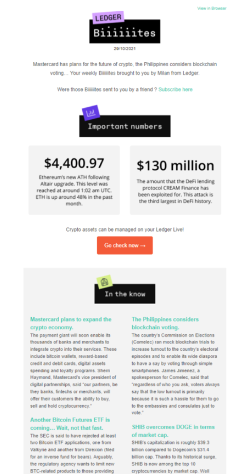
The Ledger company offers solutions for securing assets in the form of cryptocurrencies, which are covered in the newsletter's financial advice. The email design is simple yet crisp, thanks to the use of color contrasts. The headings of each section are placed in dark boxes so they stand out from the rest of the content.
Source: Sender
The authors attract the reader's attention by starting with pointing out important numbers and statistics and their importance for the cryptocurrency market. The use of numbers in a newsletter has an essential advantage - such content doesn’t take up a lot of space in an email and has great value for the reader.
The authors then move on to more extensive descriptions of the various materials recommended in the issue. Their titles are highlighted in bright colors.
Best retail newsletters
As we’ve already mentioned, the primary purpose of a newsletter isn’t to sell. However, nothing prevents you from using this kind of email to present your offer to your audience by promoting blog articles about your products or services.
3. Babylist
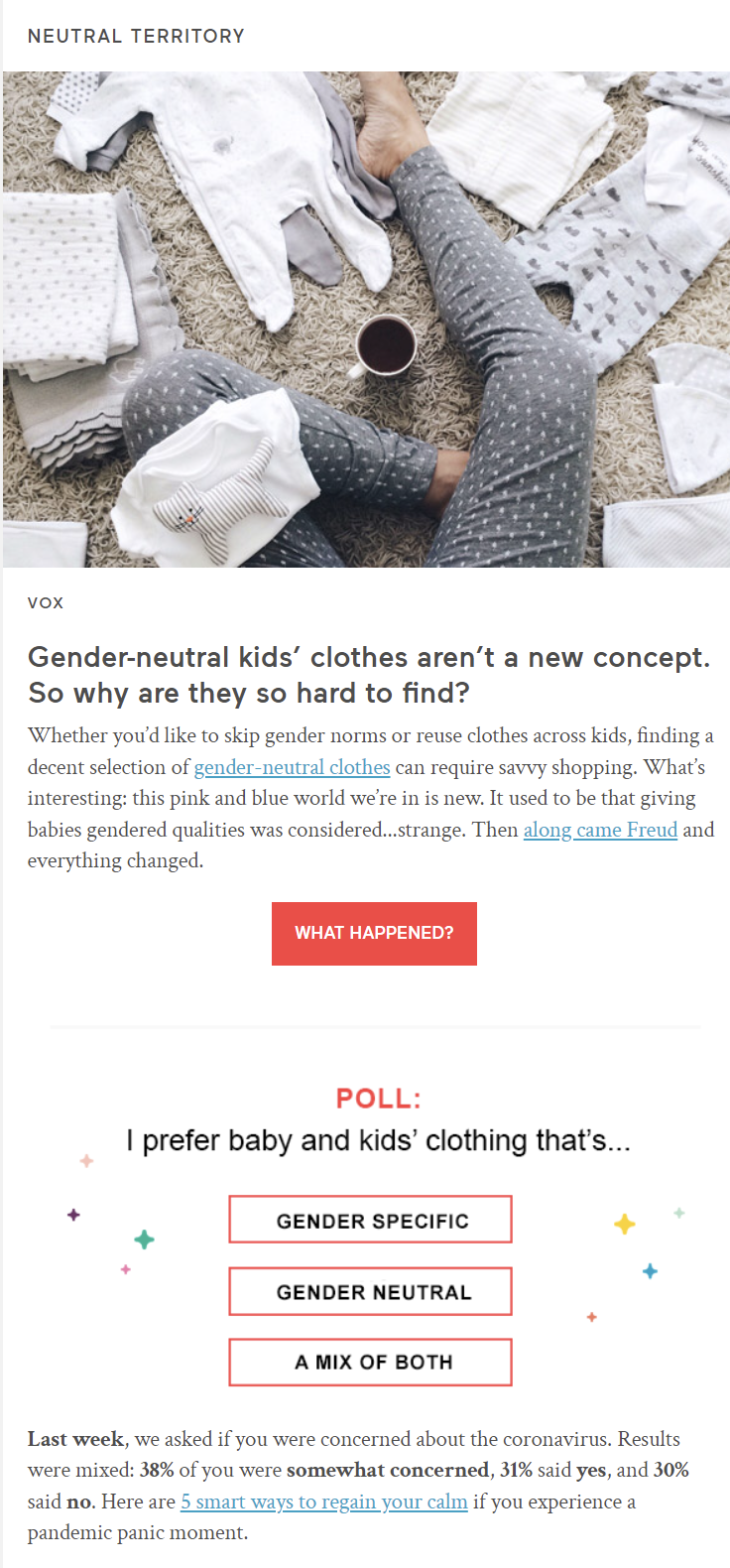
The Babylist online baby accessories store's newsletter focuses on products for children and parents. The blog content is highlighted in the newsletter with large photographs that relate to the article's topic, accompanied by headlines and short introductions. Under each article’s summary, there is a unique call-to-action button, such as See for yourself, What happened, which ensures that browsing the news isn’t monotonous. The newsletter is kept in a light tone, motivating to read the numerous articles linked in the message. In between the recommended texts, selected products are also promoted.
Source: MailCharts
The interactive element in the form of a survey is located about halfway through the message. By including this type of section in recurring messages, the brand shows customers that their opinions and beliefs are important. In this way, the company also presents data on industry trends and customer opinions on various topics, which it then summarizes in subsequent email newsletters. Such a procedure has three advantages:
- The brand presents readers with interesting statistics.
- Recipients interact with the message and become more engaged, making them more attentive and familiar with the content.
- The company gains useful information about its potential target audience.
Best food newsletters
Newsletters about food usually stand out with stunning photographs, making the recipients hungry. These types of emails often promote content related to cooking or tasting.
4. Ben & Jerry's
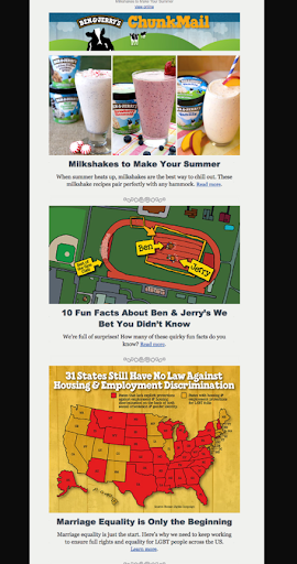
Ben & Jerry's is an ice cream company that sends out its own periodic newsletter, sharing a variety of content, including the one about its products. The centerpiece of this email is interesting facts about ice cream. In their messages, the creators combine distinctive graphics reminiscent of cartoons or animations with photos of actual products.
Source: Compose.ly
It's an unusual idea to present light-hearted content in a newsletter right next to serious ones about social issues and how the brand is trying to change the world for the better. This shows its social responsibility and can have a positive effect on increasing customer loyalty.
5. Starbucks
The globally popular coffee shop chain Starbucks sends seasonal email newsletters to its customers to let them know what new things they will be able to find on the menu during a given period. It's worth noting that this isn’t simply listing the most important information. The brand increases the reader's attentiveness by asking them in the newsletter header what they prefer - product A or B.

Source: Kinsta
These newsletters are mainly distinguished by juicy colors and attractive graphics. The design of the newsletter is well thought out and divided into sections, thanks to the appropriate use of colors. In addition to fulfilling an informational and promotional function, this newsletter also has a sales function. In the last section, the brand presents a product of its choice and encourages purchase by placing a link next to the content redirecting to the online store.
6. The New York Times Cooking
The New York Times is known not only for publishing the latest news but also for running an interesting and extensive culinary web section filled with recipes that are accompanied by beautiful photographs.
The New York Times Cooking newsletter is, of course, about cooking. Each recipe is presented in a separate section, along with a corresponding header, which gives a sense of order and improves the visibility of all elements of this newsletter design. There is little text, as it’s the photos that are meant to entice the viewer to go to the web page with a given recipe.

Source: Email on Acid
This newsletter shows that a mailing doesn't have to be complicated or extensive to get the reader to visit the website. It’s enough to deliver in it the value expected by the recipients so that they engage in interaction with the content.
Best B2B newsletters
Competition in the B2B services market is huge. Companies are outdoing themselves, creating interesting newsletters with business tips for entrepreneurs.
7. General Assembly
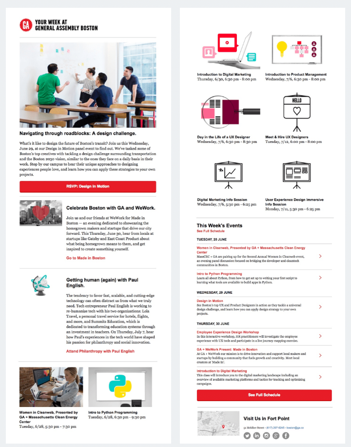
General Assembly is an educational company that provides various training courses, primarily in programming and marketing. It uses its newsletter to share interesting content and inform audiences about current events and ongoing courses. This ensures that they don't miss meetings or opportunities to take advantage of the organization's offerings.
This message is distinguished from other newsletters by good organization of a large amount of content. The email is extensive and contains a lot of information, but the appropriate graphic division of sections makes the text easy to read. Buttons in the newsletter allow the recipient to quickly jump to the details of a specific course or the full schedule of meetings organized by the General Assembly.
Source: Campaign Monitor
A newsletter of this type works best if it’s sent to an active audience that regularly views content from a particular industry or uses a particular company's offerings.
8. Workable
The primary function of the Workable newsletter is to promote the brand by providing recruiters and other potential clients with valuable information and tips to help them improve their recruitment processes. This particular b2b newsletter message begins by outlining the problem - ineffective recruiting.

Source: Moosend
Workable, a company that develops software for recruiters, makes great use of CTA buttons in its newsletter. Each article is highlighted with a clear headline, a few-sentence summary, and an original CTA that relates to the content. For text about real-life candidate complaints about the hiring process, Workable encourages Hear them out, and for material on planning the workforce, it advises Plan for success.
Call to action buttons aren’t the only interesting elements of this b2b newsletter. The company also shares links to sources its employees use to expand their knowledge and encourages a visit to its website, suggesting to the readers that they will find more useful material there.
9. Brafton
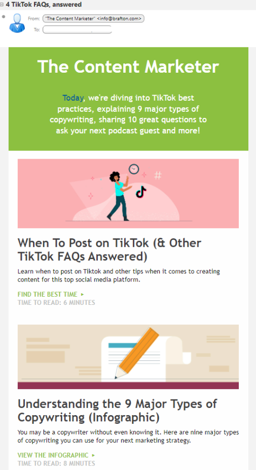
Content marketing agency Brafton regularly sends out a newsletter with tips on promoting a brand online. In the introductory text at the very top of the email, the creators briefly explain to the reader what they can find in the rest of the message. This lets the recipients know right away if the email contains information that interests them.
Source: Personal Branding Blog
The design of this newsletter is mainly distinguished by the use of distinctive colors and interesting graphics. In addition, individual articles are accompanied by a headline, a short summary, an original CTA, and information on how long it will take to read a given linked text. The message also includes an invitation to subscribe to the newsletter for those who received the message from their friends rather than directly from Brafton.
Best newsletter designs - summary
The fixed form of the newsletter - similarly spaced elements and their length - allows the recipient to quickly read the content. Both comprehensive and concise messages sent periodically can help a company meet its goals.
The success of email marketing depends on many factors: the style of communication, the quality of graphics, the appropriate design, and the content being conveyed. If you want to make sure your newsletter doesn't lack key elements, use templates. You can do this by using marketing automation software such as Mautic. We’ll be happy to help you implement it and advise your specialists on how to use it in their daily work.


