Double mobile sales in a Drupal Commerce store
At Droptica, we designed and implemented a new design of an online store for mobile devices for one of the oldest publishers in Poland. We used Drupal 7 Commerce and did some search engine optimisation. The results? Increased sales!

Publishing house
Three years ago we started cooperating with Wydawnictwo WAM Publishing House, one of the oldest Polish Catholic publishers, providing them with our Drupal development services. In addition to books on religious topics, they also publish scientific and popular science publications, with a total of about 150 titles a year. Their products include prayer books, catechisms, academic dissertations, literature, biographies, young adult books and cookbooks, including the famous recipes of Sister Anastasia.
“The most admirable work of our time” said Pope Pius XI about the "Apostleship of Prayer,” which was the source of the Krakow-based Wydawnictwo WAM Publishing House. It was founded in 1872 by the Jesuits. In practice, this means that WAM celebrated its 145th anniversary in 2017.
What is more, the publishing house received many awards and distinctions, including the Magellan Prize, 2014 Feniks Award and many more.
The publishing house also runs an online store and Deon.pl – social networking and news website.
The start of cooperation
We started our cooperation by building modules to improve purchasing on their website. Some of the notable examples include:
- a module allowing users to send purchased products as gifts;
- pick-up point selection;
- integrating Drupal Commerce with Freshmail, which allowed the publishing house to target newsletters and send information about new products via e-mail.
Mobile version

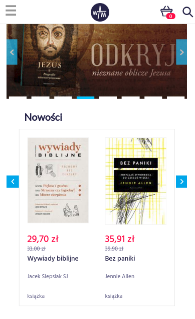
Our task was to modernise the Drupal Commerce store mentioned above. It was nice and pleasant on the desktop; however mobile devices were another story. The store was designed and created a couple of years ago using Drupal 7 when mobile shopping was mostly unheard of. The times changed. The customer expects to be able to browse the goods, find out more about the products and purchase them using any mobile device.
Since the standards today are totally different than when the store was set up, the graphic design and layout had to be improved in order to make shopping from mobile devices more convenient.
There is no doubt that traffic and purchases from mobile devices are on the rise. At the same time, we should remember that even if the customer prefers to place the actual order using a computer (for example, because they might prefer to enter data using a standard keyboard), they often learn more about the offer and browse goods on a mobile phone or a tablet.

We had to act.
We started with the preparation of a new graphic design. Our graphic designer created a design tailored to mobile devices, which not only looks nice but also improves and facilitates interaction with the user.
We decided that not only we would change the layout, but we were also going to choose appropriate fonts, which would be better visible on mobile devices, and change the colours. The desktop look would remain unchanged.
After a few minor changes, the client accepted the new design and our developers started working on it.

We started by moving CSS to SASS pre-processor. Variables, mixins and a cleaner structure made working on changes in the graphic design faster and more efficient.
At the same time, our QA department started creating tests in Codeception. One of the main conditions was to leave the desktop layout unchanged, testing in Codeception was supposed to capture the current appearance and inform about possible undesirable changes in the course of later work.
After initial preparations, we started working on the layout change. Our main priority was the purchasing process – the cart page, payment method selection and delivery. Then we changed the product pages, information pages and search results.

At the same time, we also developed new tests to make sure that changes in the code do not cause changes in other parts of the store, that would be difficult to notice otherwise.
It turned out that not only changes in SASS/CSS, but also additional JS code were required. For example, the website had a number of carousels with graphics. In order to make sure that they worked properly, we had to additionally change and expand the existing JavaScript code. We have added additional drop-down elements on subpages in smaller resolutions and we completely rebuilt the menu, together with the addition of the so-called sticky menu for mobile devices.
Before each implementation we performed automatic and manual tests, we analysed the entire purchasing process and checked the layout along the way. We checked everything in different environments and browsers. We fixed all the bugs that popped up and made sure that the layout was unified.
Throughout the process, we regularly implemented the results of our work, on average once per week.
Summary of changes
- Improved layout for mobile devices – it is now clear, it attracts customers and makes it easier to navigate the site and make purchases.
- Changes in the purchasing process (forms were adapted to the mobile layout) to speed up shopping and facilitate the choice of delivery and payment methods from smartphones and tablets.
- Fixing bugs on mobile screens.
- The website was adapted to current standards.
- Implementing automatic testing, helping us catch bugs and saving developers' time.
- Reduced session duration coupled with increased revenues for customers using mobile devices. This means that the customers find what they are looking for quicker than before.
- Increase in purchases made using mobile devices by 200%.
The client was very satisfied with the new layout, but we were most satisfied with the sales growth. After a few months of measurements, it turned out that not only were more purchases made via the desktop version, but purchases made using mobile devices increased twofold in comparison to the same period in the previous year.
SEO
After completing the work on the mobile layout, we focused our efforts on SEO (search engine optimisation and positioning) in order to attract new customers, increase traffic on the website and add new information about products in search results.
We started from connecting the website to Google Search Console, a tool that allowed us to measure traffic on the website, improve performance and catch bugs. Then, we implemented changes based on the SEO audit, which included:
- improving headlines;
- adding a notification for editors if the optimal number of characters in the description tag is exceeded – the information in the tag is displayed as hints during searches;
- adding a sitemap;
- adding price and product availability to Google search results;
Additionally, we optimised the size, proportions and quality of graphics on the website.
The size of graphics and page loading speed is important for Google Search optimisation. The faster the page loads, the greater the rank, which in turn increases the probability of ending up on a high position in search results.
Smaller graphics result in faster page loading times. A faster connection enables serving more customers. Fast page loading is also important for customers using smartphones and tablets, especially when their connection is weak and slow. Thanks to that, more people can conveniently browse the pages and shop more frequently.
Results of SEO work
- Changes resulting in a higher position in search engine results.
- Increased traffic from search engines (Google and others). Traffic increased by 50%.
- Indexing all pages belonging to the Wydawnictwo WAM Publishing House bookstore. Google and other search engines now crawl the entire content of the pages, indexing all products and improving the publisher’s competitive edge.
- Adding tools informing about traffic on the website.
- The search results include additional information regarding price and availability.
- Easier work for editors (SEO compliance information) when adding new items.
Summary
Work on the new mobile layout and SEO-related changes resulted in a number of benefits for the Wydawnictwo WAM Publishing House. The most important of these were:
- A significant increase in website traffic and sales in the months following the implementation of the changes.
- Increase in desktop sales by 50% compared to the previous year.
- Increase in purchases made using mobile devices by 200% compared to the previous year.
- 84% more new users.
- A new layout that makes it easier for customers using smartphones and tablets to navigate and make purchases.
- New layout and graphic design for mobile devices.
- Quicker page loading times.
- Reduced rejection rate.
- Full GDPR compliance of the store.
- Improved (simplified and sped up) purchasing process – from the shopping cart to selection of the delivery method.
- Making sure that Google and other search engines crawl all content, products and items.
- Additional product information in Google search results.
- Easier work for editors working in the bookstore.
- Compliance with current standards.
- Introduction of automated tests that will make it easier and faster for developers to later work for the publishing house.
We continue our cooperation with Wydawnictwo WAM Publishing House. We are currently working on improving warehouse processes.


