How to Create Charts in Drupal with the Charts and Charts Twig Modules?

In this blog post, I'll share how you can easily and quickly create charts in Drupal using Twig's Charts and Charts modules. This guide will be especially useful for publishers, but also for anyone who would like to have a similar feature in their CMS. I invite you to read the article or watch an episode of the Nowoczesny Drupal series (the video is in Polish), where each activity is shown step-by-step.
Installation of Charts and Charts Twig modules
To create charts in Drupal, we only need one module. We don't need to install any additional libraries to display these charts. All we need is the Charts module. It can be further extended with the Charts Twig module.
Installation is simple and no different from other Drupal modules. You simply need to download the Charts or Charts Twig module, if you want to use Twig for our charts and install it on our website.
As we download the module to the Modules Contrib directory, it will appear in the list of all modules.
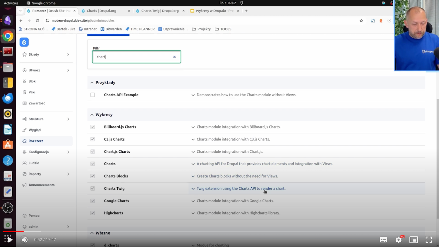
And here, as you can see, I already have Charts modules and other submodules installed, which add libraries for us to display given charts. Popular libraries such as HighCharts, Chart.js, and Google Charts are also available.
In the remainder of this article, I’ll show the configuration of the charts in question and, most importantly, how such charts are created.
Four methods of displaying charts with the Charts module
With the Charts module and Charts Twig, we can show charts in four ways.
The first and most popular way is to generate such a chart using the Views module.
The second way is to insert a block specially created for this purpose with the Charts module. There, you manually add the data you want to be on the X-axis or the Y-axis. As a result, this chart appears.
The third way is to add a field to an entity, such as content type. This field will also have the ability to manually insert the data you want to appear on the chart axes. We can also upload this data from a CSV file using the upload option.
The fourth way, which is provided by the Charts Twig module, is to generate a chart using the PHP code, Twig. We can, in some preprocess, get the data, for example, from some API, put it into Twig, and display it on the chart.
Of these four ways, in Views, that is, the Views module, and in Charts Twig (that is, PHP, data from some API) we can show the data dynamically, and with a block or field - the data is presented statically, manually is provided. And once they are provided, they "sit" there.
Configuring the Charts module in Drupal
What does the configuration of the Charts module look like? It’s uncomplicated. We go to the Extend tab. If we don't know what link to use to configure a particular module, in this case, we choose Charts, and here is such a Configure button.
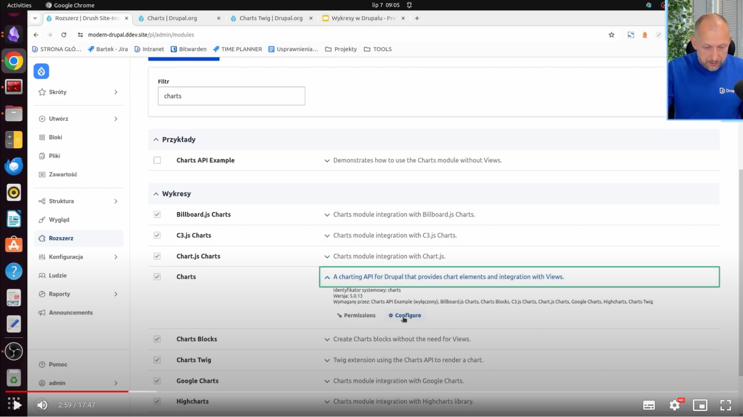
And here, you can set either default or advanced values for all newly created charts.
Let's say I want it to be HighCharts and that the graphs are always linear. It’s worth noting that these are not rigid settings. Each of the ways of displaying charts, i.e. the above-mentioned Views, Block, Field, or Charts Twig, can change these settings, of course.
How to create a chart in the Charts module?
I’ll now show four ways to add a chart in Drupal.
Method 1. Create a chart with stock prices using Views
I prepared myself a content type - Stock Price. It doesn't have a reflection on actual stock prices, but the idea is to see how the stock price changes over time in this case, and show it on a chart.
What does this content type look like? The structure of the content type is Stock Price. Go to the Manage Fields section.
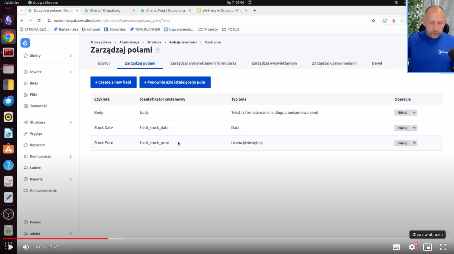
Here we have Stock Date - the date will show up on the X-axis, and Stock Price - the change in this price will show up on the Y-axis. All this will create such a cool graph of the price over time. How to do it most simply? Just by using the view.
Structure -> Views -> Add new view
I am adding a new view. I’ll call it Stock Price. It’ll create some pages with the Stock Price address. I save and change the settings for myself so that, for example, it shows me fields. For now, it’ll add a standard Title.
I’ll want to display the price and the date, which means I'm adding these two fields that are just in this type of content.
And at this point, all the contents showed me. I need to add a filter - Content type. I choose Stock price and click Apply. All the stock prices appeared to me here. I don't want the title, because I don't want it on the chart, so I just deleted this field. And with that, I have all the data I need, i.e. the date and the price.
I'll still set it by date. In the sorting criterion, I'll add Stock Date, select Sort Descending, and click Apply. The other filter, i.e. the date of addition, I’ll remove, I don't need it in this case. I will save this data.
I see that there is a date from the latest to the earliest, together with the price of the shares in question.
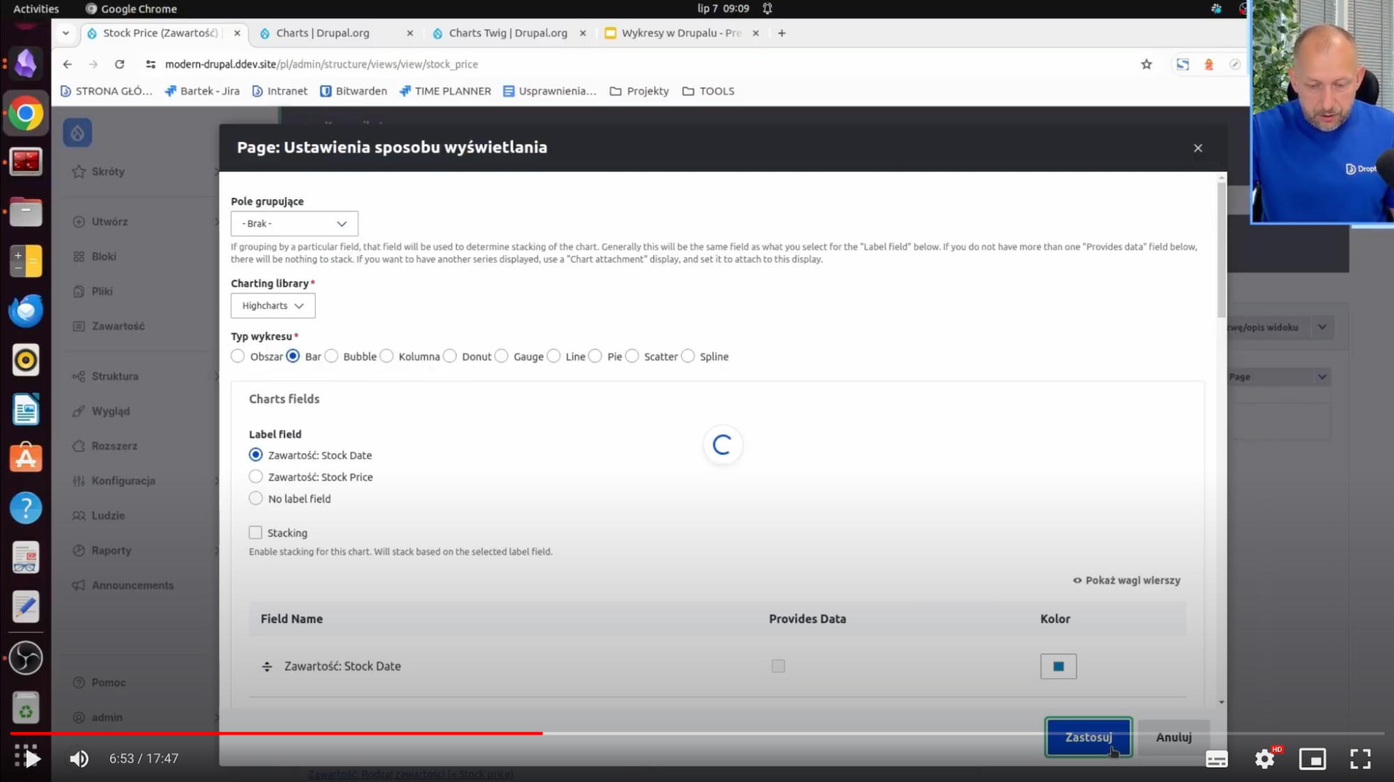
And now how to display it on a graph? Very simply. I change the format from Unformatted List to Chart, give Apply, and then I have all the settings visible above in the general settings, i.e., Highcharts, Line, etc.
I set which field should provide the data - Stock Price. Next, I have settings related to the X, and Y axes and labels. I leave as is standard, apply and a chart shows the date and price of this stock. You can also see how it changes over time - there is a downward trend.
What do the other charts look like? You can test it in the settings. You can still choose a Bar, for example, which is a bar chart.
It's less visible when it comes to stocks, but you can experiment with different types of charts. In the case of Charts.js, the line is a little thicker. You can generate such a chart very quickly.
Method 2. Display the chart in Drupal using the block
The second way you can display charts is with Block. How to do it? In a very simple way. You need to create the appropriate block.
Structure -> Block layout
In this section, for example, we need to select something like Charts block in the Place block content.
This is the type of block that is provided just by the Charts module. Just do Place block and further we find the same settings, that is, the data type of charts (let's say linear), and manually we can enter what is on the X axis and what is on the Y axis.
I enter data 5, 3, 8, 4, 13 so that it is ascending. I’ll also restrict myself to a given block so that it appears to me only on the main page, I save and it is in the content. I move it to the very top - the block displays correctly. You can see the X-axis and the Y-axis together with the values - ascending, which is the way we wanted it.
Method 3. Generate Drupal charts using Fields
The third way is to create a field, for example, in the content type.
How to do it? Very simple. First, we need to have a content type for which we want to add the field. I’ll add it to some existing content types. It will be an article.
Structure -> Content Types -> Article
I go into the Manage Fields operation and I need to add a new field that will display this chart for me. I click Create new field, select the chart, then click Continue. I have to name myself this chart - field_charts - and I save the settings. With that, this field is already added and all I have to do now is add an article.
Create -> Article
We already have the Chart field.
In the same way, as it was in the case of blocks, we also choose the type of a given chart and manually insert data. Here (as in the block) there is also an option to import a CSV file precisely with the data based on which a given chart will be displayed.
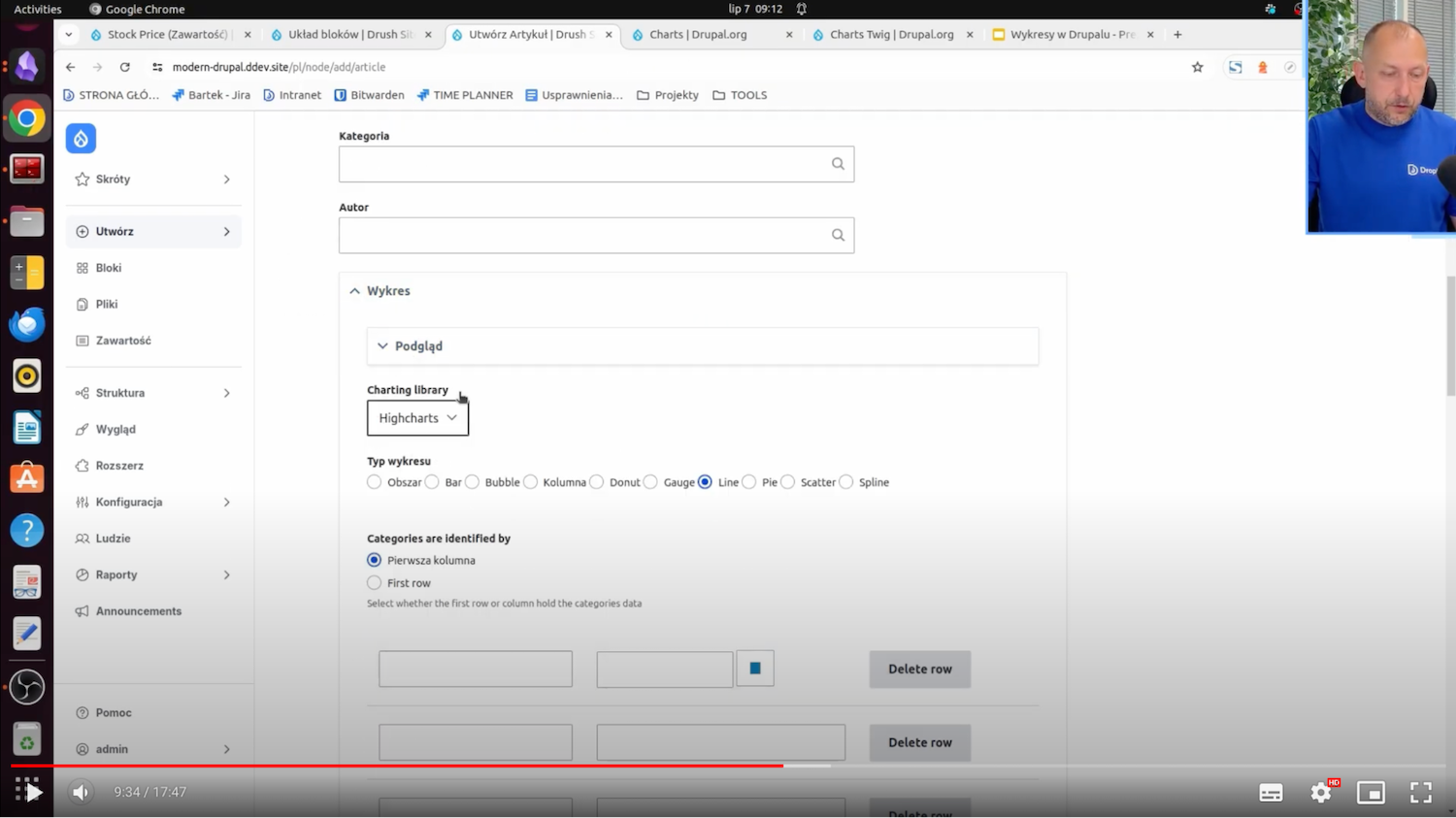
Method 4. Create a chart in Drupal with Charts Twig
The fourth way to display a chart is to using Charts Twig. For this, we need to have the Charts Twig module installed. I already have it.
I also already have a custom module created that will display the block for me. I’ll load Charts Twig in it with dynamically added data that will appear on this chart.
I will now move on to PhpStorm, where I created a custom DCharts module. You can generate such a module with Drush or add it manually. This is a very simple module that creates for me only a block.
Here there is a class for the block and build, which is a method that determines how the block should be built. She here just gives the information that all the content is in the Twig file - sample_chart and still passes custom data, date, and x-axis. There are sample data "10, 20, 30" from the Y-axis and labels that will be on the X-axis.
What does it look like from the Charts Twig side? It's very simple. I set the Title, I set the series, that is the variable that will be loaded into this Charts function.
The Charts function is available in Twig only after installing the Charts Twig module.
The date variable is one of the most important ones because it determines the very dynamic data that can be loaded from PHP. She comes from SampleChartBlock. Here, it is hardcoded "10, 20, 30,” but you can see that there is an option to load this data dynamically using some API, for example. Download the data from the API and display it here.
In Sample-chart.html.twig there is already a firing of this function itself. You can see the name of this chart, its type, series, and the data on the X-axis and title.
In fact, this is enough. With this, there is already a block available that will display this data to us.
To display this block, then, of course, you need to go to the block layout page and place the block in the content somewhere. It’s called SampleCharts. This is the same name that was used in PhpStorm in the name of this block.
I click Place block. There is no configuration here because the data comes from PHP. I save the configuration. The chart will probably appear everywhere now because I didn't give any restrictions.
There is SampleCharts - this is the block title. The Chart Title is the data that comes just from Twig. On the X-axis we have the "A, B, C" data, and on the Y-axis we have the data I put in there, which is "10, 20, and 30."
Additional examples of charts
I will also present some charts that are reflected in real life, e.g., on pages for publishers.
I have already prepared such views that present:
- The number of articles added per day,
- The number of articles added per day by category,
- The number of articles added per day by author.
These charts reflect reality for publishers and editors who want to know how progress is going in creating content by given authors or in given categories.
You can also see exactly how and what is being added. For example, by category - you can see that June 24 was a strong shot when it comes to articles on Drupal:
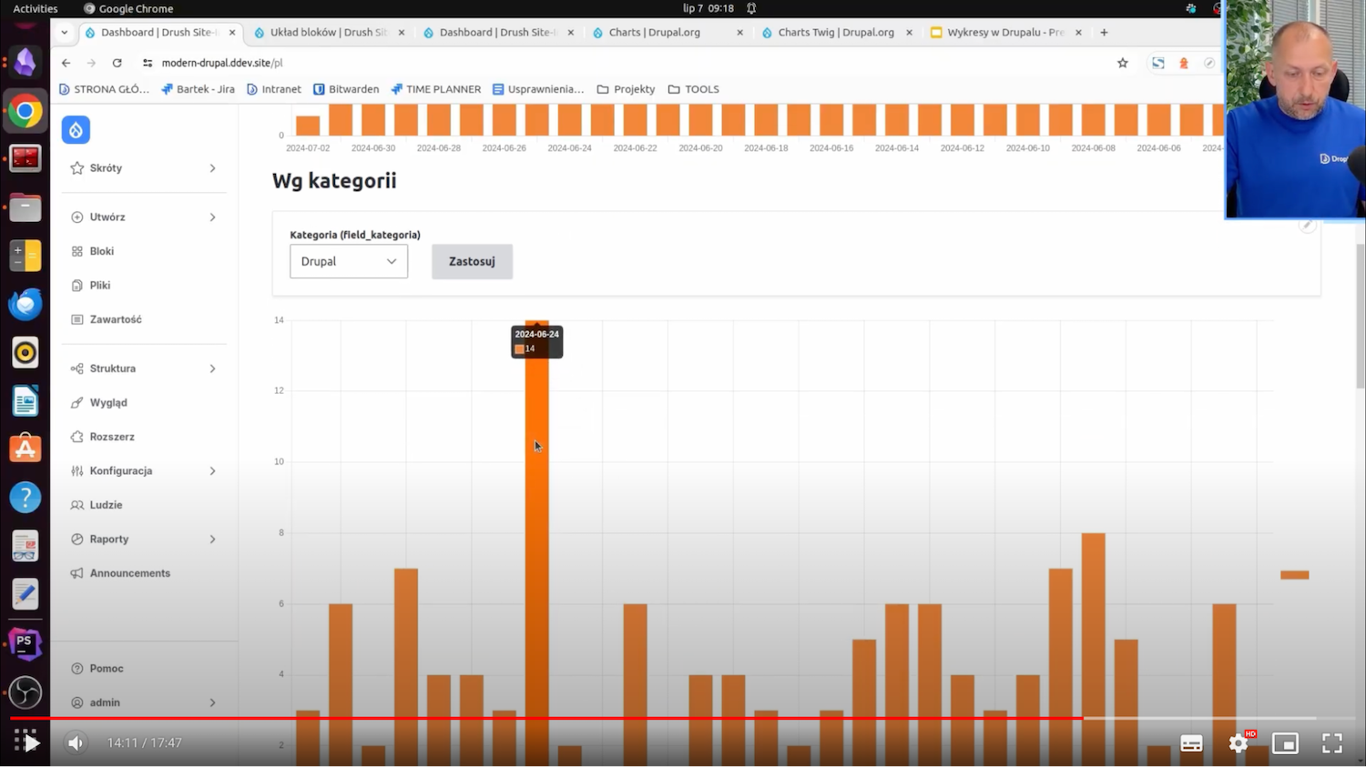
Of course, you can also change this category for yourself, for example, to Safety, and then you can see how the articles were distributed just in this category.
The charts displayed by the author work on a similar principle. We can see which authors and what kind of occupancy they have when it comes to creating and publishing articles.
What do these views look like? They are a little more complicated than this stock price view. I'll show it using the first chart as an example.
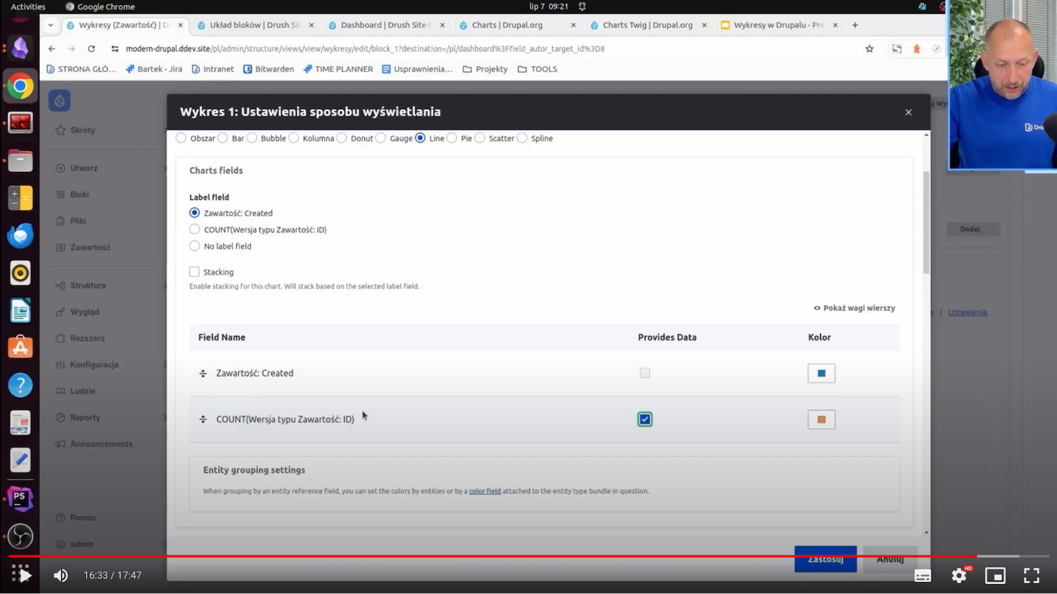
On the X-axis is, of course, the date of creation of a given article, i.e., there is Created content. The second value, on the other hand, counts the number of articles on a given day. In this case, the Content: ID field is used, but you can also use the Content: title field because here, it's just that this is the field that is used for the count.
In this case, the Count function, or count, is still used, and next to it is the Aggregation Settings. The aggregation type has the translation Number, but this is simply a Count.
Aggregation functions are available when the Aggregate switch is enabled.
This way, we can count the quantities of given content. They just show up on the graph.
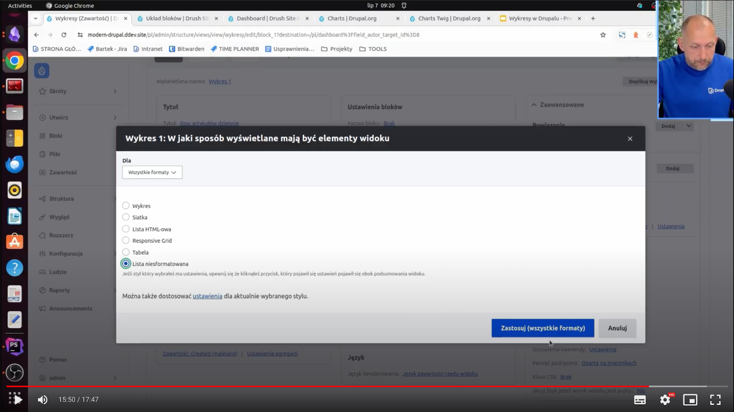
What would it look like without the chart? I choose Unformatted List.
Then you simply see the numbers that count up for a given article - on July 2, there was one article, on July 1 - twelve, and so on. This counting is possible when aggregation is enabled. I will now go back to the older settings with the chart.
Here you can see which data you want to display on the Y-axis - this is the ID-count, which is the number of these articles.
And here you can see how this type of chart has changed:
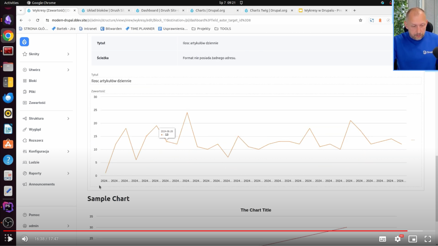
It’s so less friendly but also has some reflection of the data.
The other charts, namely the number of articles by category and the number of articles written by a particular author, are done in virtually the same way. With this, you can see how we can just clearly show the different data that can be applied to real websites.
Drupal Charts with modules - summary
Thanks to this article, you now know all four possible ways to add a chart to your website on Drupal - using the Views module, block, field in entity, and Charts Twig module. If you need assistance with setting up charts or any other type of technical work, we have a CMS development service for publishers, and we can help you.