What are the Best Engineering Websites? 6 Examples With an Interesting Design
In the case of engineering websites, a unique, well-thought-out design, interesting functionalities, and intuitive navigation are a must. Thanks to them, potential clients will immediately understand what you offer. Engineering services are quite a complicated field, so it's worth focusing on the clarity and simplicity of the message. Check out 6 interesting examples of websites of companies offering engineering services and find inspiration.
Important elements of good engineering websites
The function of an engineering website is to acquire leads, which are the potential clients whom a company can present with an offer and negotiate a contract. Such a web page, due to the technical nature of the services presented, should indicate the high innovation of the company and its extensive experience. This effect can be achieved by adding useful, unusual functionalities and taking care of the modern design of the company website.
Graphic elements
The key is an original graphic design that will reflect the nature of your company. It's important to use the right colors and create a distinctive, modern (invoking innovation) design with the use of high-quality graphics (preferably those that show your employees and their workplaces). Photographs from trade fairs, meetings, and real places where the company's products or services are performed increase the credibility of the brand.
More and more companies are choosing to put a video at the top of the website, in the hero section. This allows the client to see the material immediately after opening the web page. A proper video can tell the user what exactly you do (examples of projects) and what the work process looks like at your company. The concept of embedding a video in the hero section is often used when designing websites for manufacturing, industrial, and engineering companies.
And when it comes to the process, regardless of whether you explain it in specially prepared videos, it's also worth presenting it in the form of an infographic. Thanks to this, the details of the work at your company will also be available to those people who don't have time for watching videos and only browse engineering websites.
Portfolio
Also, don't forget about a detailed portfolio. Entrepreneurs are looking for a specific service, so, in addition to presenting the advantages of potential cooperation, show them the implementation of similar projects. Focus on developing your portfolio. Describe the projects in detail and indicate what the client has gained, thanks to your support. On the subpages devoted to individual projects, you can publish testimonials from clients preferably right under the description of the operations carried out. This element can also be put on the home page in a separate section, thanks to which the client will find it quickly. It’s also worth considering displaying the comments related to specific services on portfolio subpages or product pages.
Blog
A blog is a marketing tool that, as a rule, enables one-way communication with the potential client (unless you allow the users to add comments and engage in a discussion). You can publish on it:
- news showing some situations in the life of the company and its achievements,
- tips and articles prepared by your employees,
- scientific dissertations related to your activity,
- descriptions of the solutions you offer.
The latter makes it easier for your potential clients to decide whether to start a cooperation with your company. In addition, SEO-optimised content helps to make the website visible in the browser.
Contact page and a form
When visiting your company website, the client should have no doubts about where they'll find your company's contact details. If they are forced to search for an email address or phone number for too long, they may get irritated and leave the website. That's why it's so important to put a button redirecting to the contact page in the main menu.
The contact page may contain:
- company address and contact details,
- map with the company's headquarters marked,
- contact form.
In addition to this, the contact form can be put on the home page (so the user will surely not miss it) or hidden under a clearly visible call-to-action button. This way, you'll make it easier for potential clients to contact you. Additionally, you can consider implementing a chatbot (or a live chat). It can also collect data from your website visitors.
The best engineering websites – examples
In many cases, enterprises offer engineering services to a wide range of industries. Below you'll find examples of the best websites of engineering companies with narrow specializations and one that perfectly illustrates how you can combine offers for businesses from multiple industries.
1. Mechanical engineering websites – Hunter
The most interesting elements: video in the hero section, contact form, video with references.
Hunter is a company that deals with mechanical engineering. It specializes in servicing wheels and tires, as well as controlling and calibrating ADAS systems (power-assisted steering). Its services also include designing and building car service workshops.
The first thing that stands out on this website is the interestingly designed hero section with a looped video. It presents the company's products, employees, and some parts of the production process. There's also a search engine in the hero section, allowing website visitors to quickly find the solutions they are looking for.
The strong point of this website is also the clear presentation of the offer. Just below the hero section, there are buttons that lead to individual product categories. On the home page, there are also areas with videos about the brand's services and products and client testimonials. The latter allows you to increase the brand's credibility - the users browsing them see a real person who tells about how the company's services and products have helped.
A Hunter's client should have no problem contacting a company representative in their area. The button (in the upper right corner of the website) that takes them to the form is highlighted in red. One of the forms on the website is also worth noting, the one connected to the branch search engine. After selecting a country and postal code, the web page shows the nearest branch and advisers (one or more may be selected) who can take care of the given case. To make their work easier, the user can indicate which products the inquiry concerns.
2. Civil engineering websites – AEI
The most interesting elements: button redirecting to a video, statistics and minimalistic graphics, and high-quality photos.
The AEI company deals with civil engineering, and the company's services include, e.g., the design of city roads, highways, and airports, as well as geotechnical services.
The hero section of the AEI website consists of high-quality photos of employees at work, as well as finished implementations. In the middle of the section, there is also the AEI in 90 seconds button. After clicking it, a visitor can watch a video about the company and its offer. Thanks to adding information about the duration of the video on this button, the client knows that viewing it won’t take much time, which increases the likelihood of playing the content.
There are also presented some statistics on this engineering website. In one of the sections, the creators of the website provided the numbers indicating that the company's carrying out many projects. To illustrate the types of services provided by AEI, they used minimalistic graphic symbols that help in quick content reception. Below are sections with short project descriptions, provided with numbers and photos, which allow for learning about the company's portfolio.
At the very bottom of the website, the potential client will find contact details, a map, and a form. Besides that element, the button in the menu also redirects to the contact page, so a person who doesn't reach the end of the home page will also have no problem accessing the form and address information.
3. Nuclear engineering websites – NUKEM
The most interesting elements: minimalistic home page, newsletter subscription button, multi-element offer pages, and an interactive map of projects.
NUKEM Technologies offers nuclear engineering services. The website of this engineering company is characterized by visual consistency. The original graphics refer to the color (orange) of the brand's logo. The specific color scheme has been applied to the entire web page, and the buttons and headers are also orange.
What makes this website stand out among others of this type is its minimalism. There are simple, concise sections presenting the offer on the home page. And the information below encourages a visitor to check out the company's portfolio and available job offers.
It's also worth paying attention to the extensive offer subpages. On most engineering websites, they contain very general information and are rather limited to short descriptions. The subpages containing information about NUKEM Technologies services consist of several elements:
- short general description of the service,
- drop-down sections with a description of the methods and technologies used,
- links to recommended materials related to the service in question.
An interesting element of the NUKEM website is also the newsletter subscription button. It’s permanently fixed in a specific place on the web page, so when scrolling through the content, a visitor can get the impression that it follows them. In addition, it stands out on the white background due to its bright color. Due to the fact that the button is visible to potential customer at all times, it effectively reminds them about the possibility of subscribing to the mailing list.
The Projects subpage was also designed in an interesting way. It contains an interactive map of the whole world. After clicking on one of the regions highlighted in orange, you can see the list of projects carried out in this part of the world, along with the buttons that redirect to the details of specific projects. The use of interactive elements engages users and encourages them to view the information provided by the website.
4. Computer engineering websites – Ascent
The most interesting elements: Why Ascent section, portfolio, and references section.
Ascent designs, builds, and maintains data centers. The photos illustrating these services and showing the company's specialists at work are available in the dynamic hero section.
The section Why Ascent? also deserves attention. In addition to a short description of the company, the advantages of choosing its offer are listed there. After clicking on a given advantage, a longer description expands. In this way, the creators of the website provide useful content but, at the same time, take care of the minimalistic design.
Ascent presents its portfolio below this section on the home page. It's dynamic, just like the hero section, showing the projects carried out by the company. The website creators used short descriptions of projects presenting numerical data (concerning the size and power of the constructed data centers). The proper description of each project (available after clicking on its photo) is longer. However, the focus is still on using headings and enumerations to present the reader with a concise and specific text. This makes the reception easier and draws the attention of the potential client to the elements that may be important to them.
Highlighting the section with clients' references on the home page by using a darker background attracts the attention of the user. The reviews slide horizontally. One after another, the testimonials are presented to the viewer. This element is extremely important because it shows how the cooperation with Ascent proceeded on the already completed projects.
5. Aerospace engineering websites – Seakr
The most interesting elements: unconventional graphics, contact form on the home page, and Our team page.
The website of Seakr, an aerospace engineering company, welcomes the user with an engaging animation in the hero section. The entire website contains photos and graphics referring to the cosmos and modern technologies, which gives it an innovative look. The entire design is complemented by a futuristic font referring to the industry.
The home page is limited to the descriptions of the services provided by the company, which keeps the potential client from getting distracted and allows him to focus on finding the information about the specific service that can solve their business problems.
The website creators achieved an interesting effect in the Our company tab. They juxtaposed the content about the company with two films in which the founders of the company talk about the technologies used, the mission, and the experiences of Seakr. At the bottom of this page are logos of the companies that collaborated with this engineering company, increasing its credibility.
The presentation of the founders of the company is combined with the infographic that explains the origins of its name. There's less text, as it has been replaced with an informative visualization. As a result, the brand communicates its message to the reader more effectively.
The Our team subpage is also worth noting. It contains photos of employees with their full names and positions and a photo gallery of the company's life. Seakr shows the human face of the company and the people behind its success.
6. Engineering services for many industries – Agilitech
The most interesting elements: clear home page, unique graphics, presentation of specializations in the hero section, and well-planned case studies.
The versatility of the Agilitech engineering company is already evident in the hero section. The video it contains presents the areas in which it specializes. It also shows the large scale of the projects and the professionalism.
The white background and sections in a slightly darker color make the website very legible, as it doesn't tire the eyes of users. The web page is divided into large headers. It's decorated with unique, high-quality graphics suitable for an engineering website because they are associated with designing and implementing solutions based on modern technologies.
Photos were also used in the main menu. After hovering the cursor over the Our industries or Our services button, the graphics (on the left) and the list of subpages (on the right) are displayed. The graphics change as the user moves the cursor over successive types of services or industries. This rather unusual approach is surprising and makes the person visiting the website more attentive to its elements.
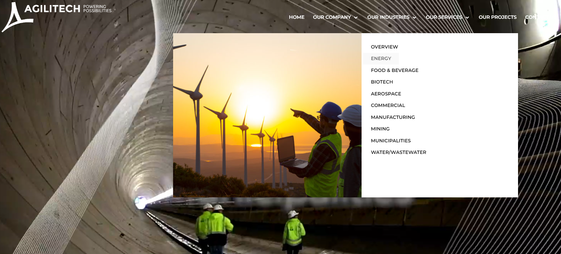
There's no portfolio on the home page. Instead, it contains buttons that redirect to specific groups of project descriptions for each industry. After selecting a specific field, a user can proceed to the selected case study. It's worth noting the simple division of the content on these subpages into a problem, solution, and result. This makes it easier to understand the technologies used by Agilitech, the individual challenges that the team can solve, and the positive effects of cooperation.
Best engineering websites - summary
The design of engineering websites should suggest professionalism and innovation. To give them a modern look, it's worth using unusual fonts, animations, videos in individual sections, and unique graphics. One of the most important elements is a detailed portfolio in which the engineering company should present its experience to the potential client. Depending on the type of project, the portfolio may consist of various elements: videos, photos, descriptions, statistics, or client references. The website of an engineering company should also include a contact page and a form for sending an inquiry.
We can create a high-quality, functional website designed with industrial and manufacturing companies in mind.


